SAINT PAUL
BREWING
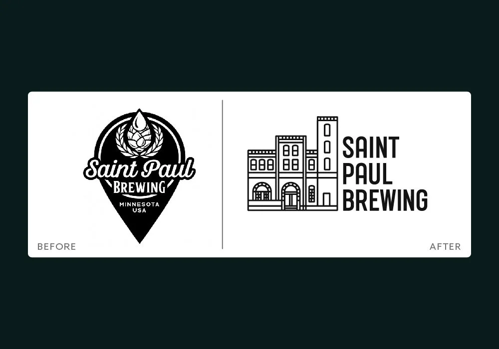
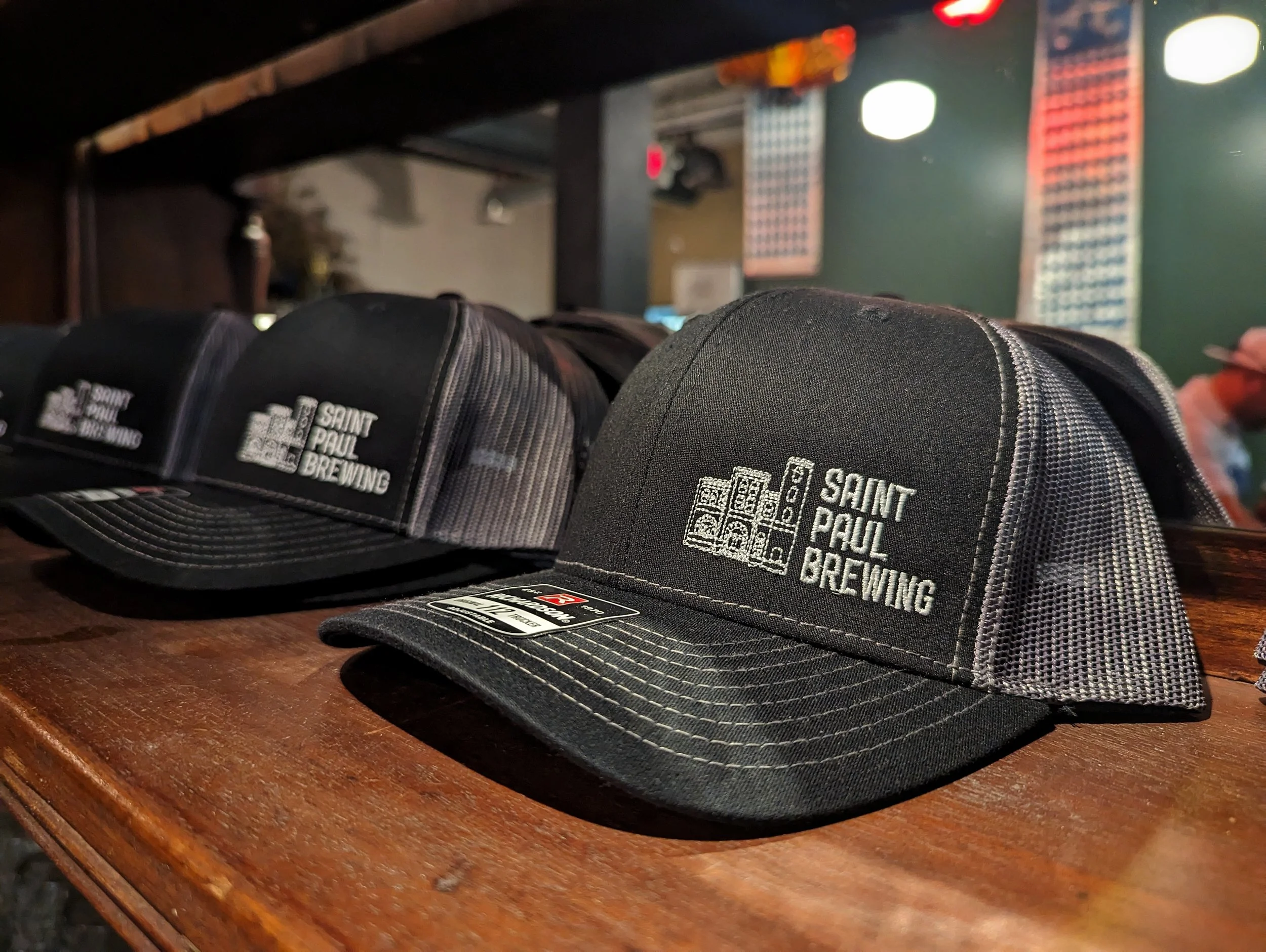
When designing a new logo for Saint Paul Brewing, we remembered that every brewery brews beers. Therefore, we needed to stay away from any generic imagery that saturates the brewing industry. No hops, no barley/wheat, no mugs or brew kettles or barrels.
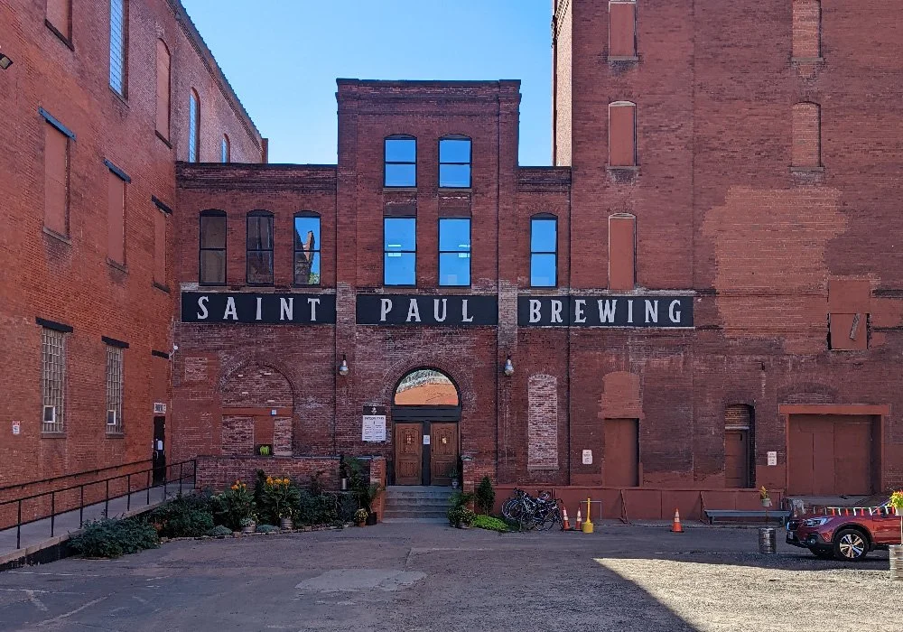
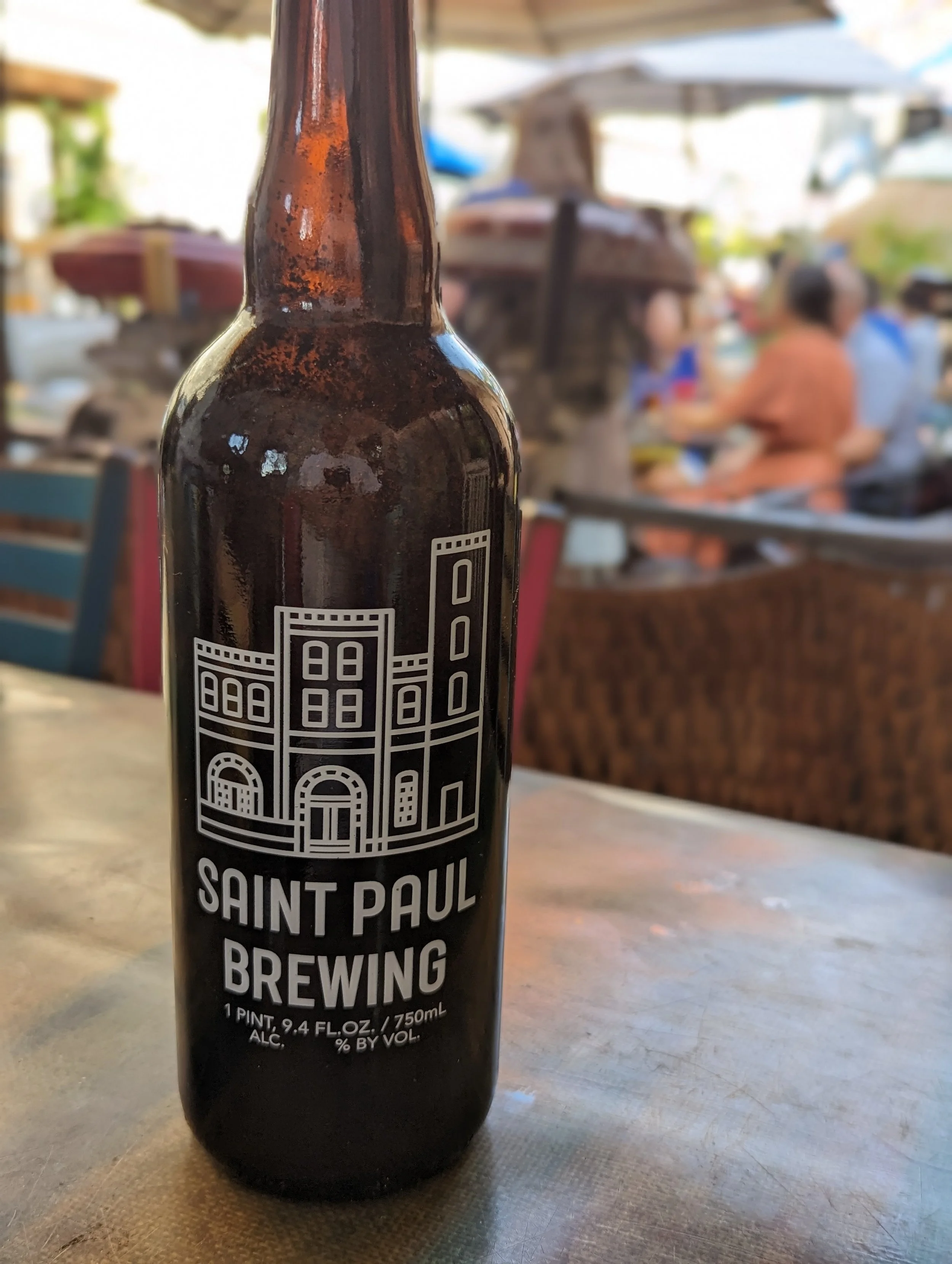
We needed to create a unique and ownable logo for SPB, so we looked at their home — the original Hamm’s Brewing Complex — for inspiration.
BRAND IDENTITY | APPAREL & MERCHANDISE
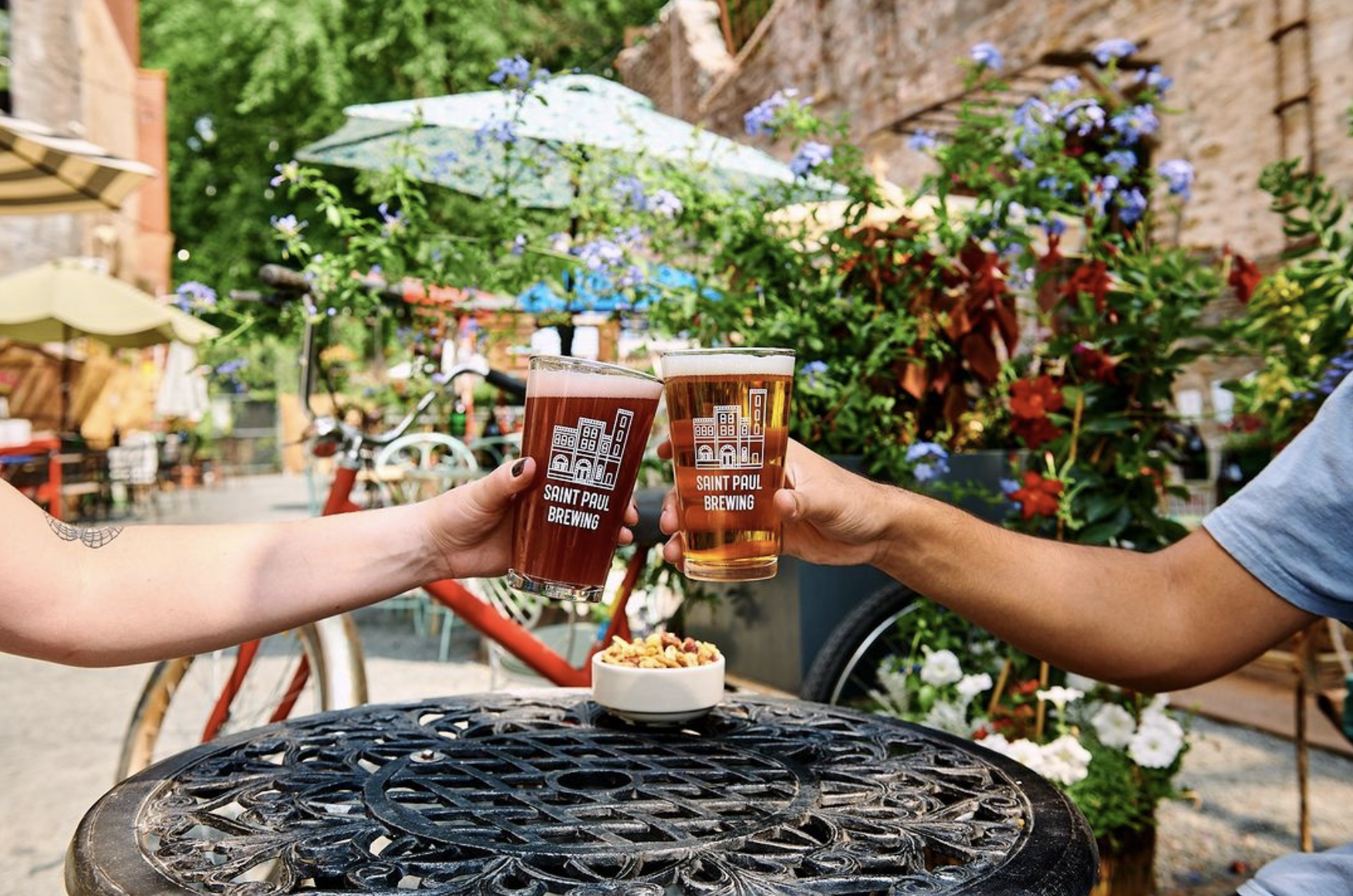
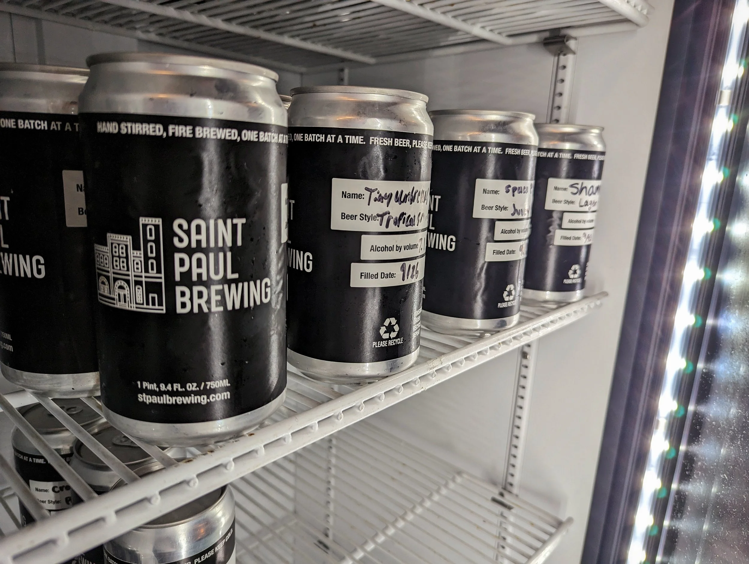
We used the historic building as inspiration for the new Saint Paul Brewing logo.
The old logo could have been used for any brewery in the world. We needed to make the new logo ownable and unique.
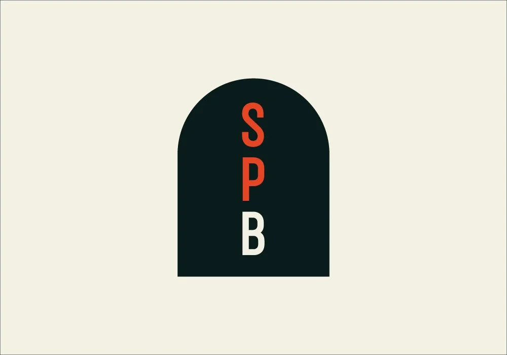
The primary colors are inspired by the materials and textures found in the historic building.
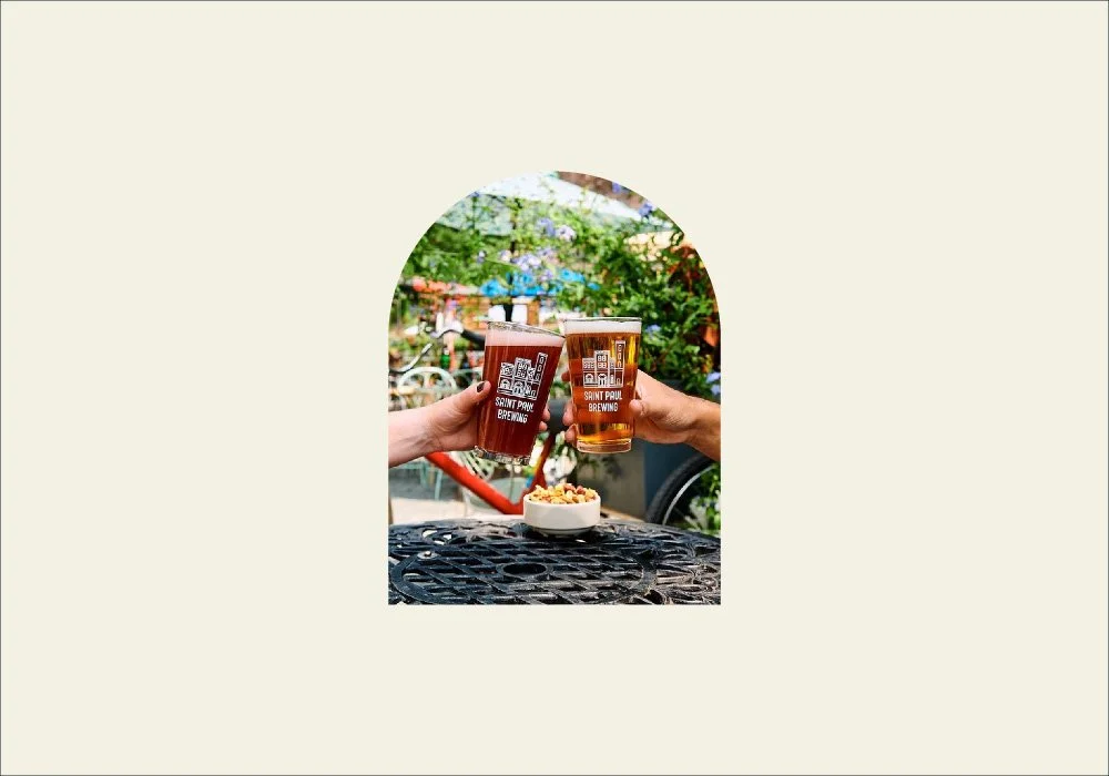
We created a type and image container with the arch found within the doors, windows, and structures of the
historic building.
CLIENT TESTIMONIAL
“What we like most about the new logo is that Dan focused on the building itself and made it into a simplified, identifiable, authentic mark.”
Jeannie Kenevan,
Director of Marketing & Special Projects
Saint Paul Brewing


